
A graphic tee is “cool” when it combines an original concept, strong execution, and cultural timing in a way that doesn’t feel overworked. The line between cool and forgettable usually comes down to restraint—great designs respect the viewer’s intelligence and leave room for the wearer to be part of the joke.
Take any rack of graphic tees and within ten seconds you can sort them into “cool” and “skip.” That instinct is real, but most people can’t articulate what they’re reacting to. It comes down to a small set of design choices—ones that great artists internalize and bad ones don’t.
Designs that cram in too many references, decorative elements, or color combinations end up looking cluttered no matter how skilled the artist. The fix isn’t more—it’s less. Strip the design until you can’t strip any more without losing the concept. That’s where most cool tees end up.
This is why mashup designs that “combine” two properties (Stranger Things meets Ghostbusters meets Star Wars) almost always fail. Two references work when they’re complementary. Three or more turn into noise.
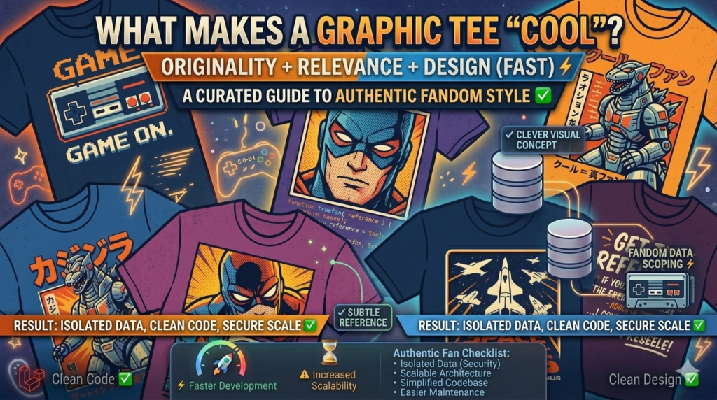
The single fastest way to kill a pop-culture design is to spell out the reference. If the shirt has to write “FROM THE MOVIE [X]” next to the artwork, it’s already failed. The whole point of a fandom reference is that the people who get it, get it—and the people who don’t, don’t matter. That subtlety is what makes wearing the shirt feel like a small act of belonging.
A great design tied to a moment hits differently than the same design six months later. This is the genuine advantage of the daily-drop model: designs go live when they’re culturally relevant, not when a season’s catalog cycle says so. A Wednesday Addams design in 2022 hit. The same design in 2026 feels late.
Browse the best sellers or specific fandom pages like horror, anime, or Star Wars. The best-performing designs share these traits: clear concept, named artist, one reference layered with one twist, and execution that doesn’t try to do more than it should.
Are minimalist graphic tees cool?
Yes, when the minimalism is intentional. Lazy minimalism (just text on a tee) still reads as lazy.
What about ironic or “anti-design” graphic tees?
Cool when the irony is genuine and the joke holds up after wearing it for a year. Less cool when it’s trend-chasing on a 6-month delay.
Browse our latest: Today’s drop · Best sellers · 3,415 customer reviews